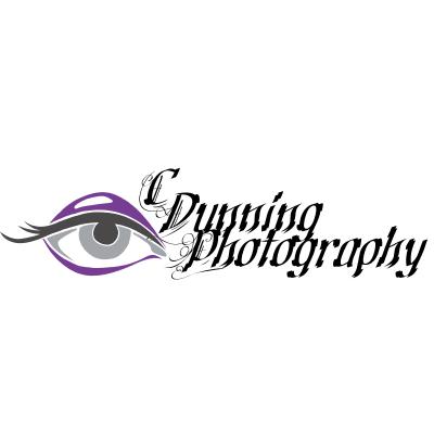
I like #1. It says to me that you you have an eye for creative photography.Originally Posted by mistressotdark

Originally Posted by whiteforest
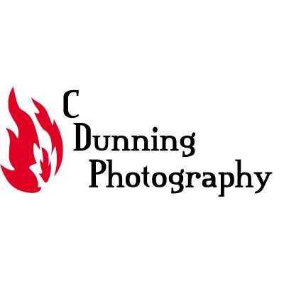
You may want to play around with the font more. Find a font that really relates visually to your work, not just a font that you like. My favorite "creative industry" business cards are the ones that have an image of the person's work on it. It is a reminder to me of what it is they do because I often remember the work first, whereas I may forget the name and then not know who it is. Some people do a full card image on one side, with information on the other. Others do a single sided business card with a thumbnail image beside the information. Also, using a logo like that as a photographer, you may get confused for being a graphic designer.


I agree. I love the way #1 looks but the font looks like it could be difficult to read for some. You want a font that is clear and that can be read easily. Otherwise, it looks goodOriginally Posted by Tari
I like #1 the best, but I'd suggest maybe going with a font that would be a bit easier to read if it's smaller. It looks OK at the size you have posted, but it might get hard to read if you have to shrink it down to fit on a business card or something.
